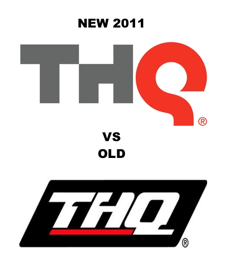
Games publisher THQ, founded in 1989 and with an almost unchanged visual identity since, announced their new corporate logo yesterday. It should reflect “emphasis on innovation ad creativity”. Im not really sure I like it, the “q” is putting me off for some reason and that shade of red is dreadful. Source: www.joystiq.com
